Gather is a passion project exploring end-to-end design, from idea to designing an MVP, including branding, for an app that helps users discover international ingredients.

As more people move across borders for work, study, or opportunity, staying connected to home becomes a quiet, yet persistent challenge. How does one fill the void of homesickness?
For me, the most reliable way to feel connected to home has been through food. Familiar flavors offer a sense of grounding. A certain condiment or dish can bring back memories and provide comfort, even if I am halfway across the world from my family.
The challenge
But sourcing the right ingredients often requires time, effort, and local knowledge, not always accessible to someone newly arrived. This can quickly become more than a logistical issue; it can affect peoples' sense of identity and wellbeing.
This led me to ask:
How might we make it easier for people to find culturally specific ingredients in unfamiliar places?


Using the mind-mapping method, two rounds of three-minute brainstorming sessions were conducted for each HMW statement. Visualizing new and related ideas helps me to understand how each idea is connected and to note down possible solutions as they come up.


Using the mind-mapping method, two rounds of three-minute brainstorming sessions were conducted for each HMW statement. Visualizing new and related ideas helps me to understand how each idea is connected and to note down possible solutions as they come up.

Click here for full size mind map images
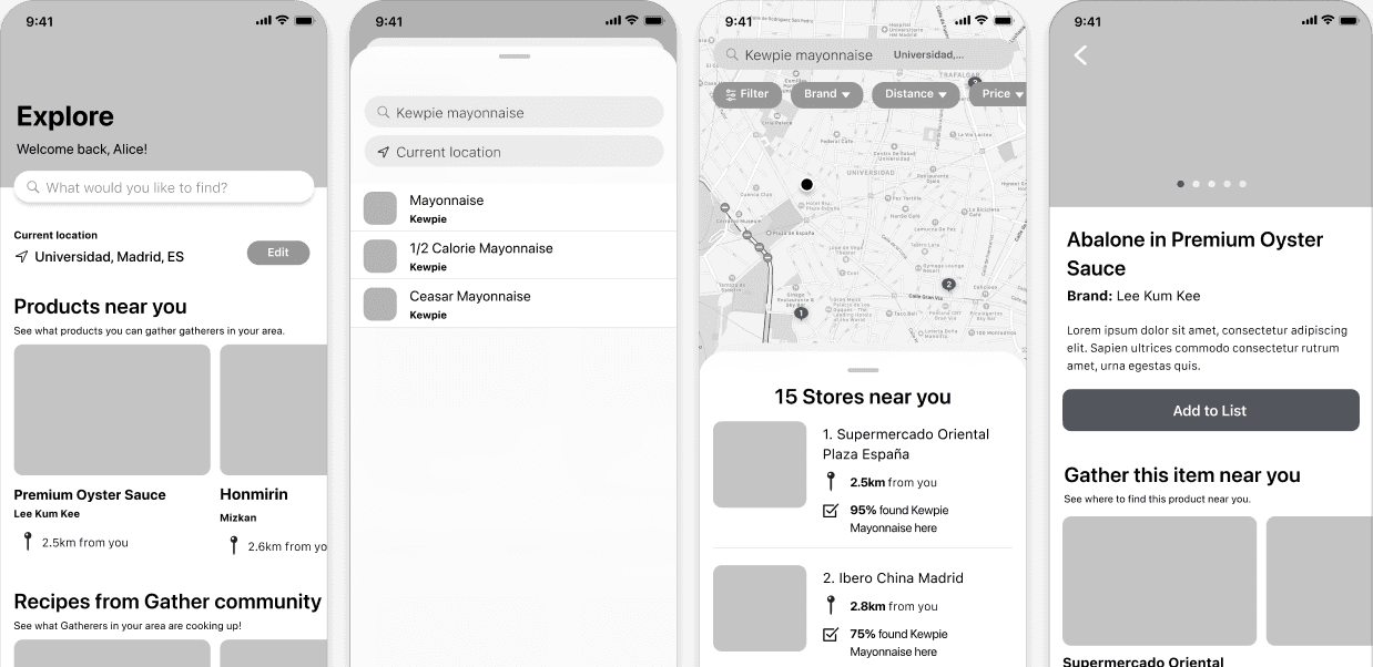
To begin visualizing the app experience, I created sketches based on initial research and made early design decisions—such as using a sheet modal on the search screen to let users toggle between map and list views. I then built and prototyped the wireframes for testing, intentionally omitting visuals like images and color to keep the focus on usability and flow.

Usability testing
A total of six usability tests were conducted with participants living in Europe, who had recently searched for international food items.
Once interviews were completed, I created an affinity map to identify patterns and define the following key revision items:
Add price and name translation to the product screen.
Expand the search section and reposition “Products near you” lower on the screen.
Add price sorting and a distance filter to the search screen.
Replace with a heart icon to let users favorite items instead.
Remove Recipes feature from MVP.
Finally, designs were brought to life by applying branding to mid-fidelity wireframes. The high-fidelity prototype is the most accurate representation of the MVP of the app and after a final run-through of the interactions, the designs will be ready for handoff.
typography
Montserrat
28px Heading 1
22px Heading 2
18px Subtitle
Lato
14px Body text
12px Caption
14px Button text
Gather
Lorem ipsum dolor sit amet, consectetur adipiscing elit. Sit ut id orci mattis. Eu eget diam ac vitae. Habitasse faucibus dignissim elit gravida eget viverra gravida.
color palette
Brand
F09B13
Accent
06948D
Base
3D5361
Neutral
182126
Neutral
F3F3F3
logo
GATHER
GATHER
buttons
Find Product
Edit

Terminology: selecting the right words to use for the project was personally challenging. “Foreign and ethnic food” is conventionally used for studies and research papers; however, these words tend to create a sense of alienation and exclusion for people for whom these foods are native and imply a power difference. Nor did “International” feel representative of the object of our users’ search. Ultimately, I used “international” and “foreign” food items.
Mobile prototype: one key observation worth noting is that most participants had never interacted with a mobile app prototype on a laptop, which occasionally led to confusion about what actions were possible. Fortunately, I recognized this during the first usability test, and in later sessions, I was able to distinguish this unfamiliarity from actual usability issues.